Understanding Your Form Analytics
Every published form includes a built-in analytics dashboard. It shows submission volume, per-field distributions, and computed output statistics without any external tools.
Prerequisites
- A published form with at least one submission.
Finding the Analytics Tab
- Open a form that has been published and has received submissions.
- Click the Analytics tab in the tab bar.

The dashboard loads with the last 30 days selected by default.
Date Range Filtering
Use the preset picker in the top-right corner to change the time window.

Available presets: 7 days, 30 days, 90 days, and All time. Switching the preset updates all charts, overview cards, and delta badges. The delta badge compares the current period against the equivalent previous period (e.g., the last 30 days vs. the 30 days before that).
Overview Cards
Four stat cards appear at the top of the dashboard.
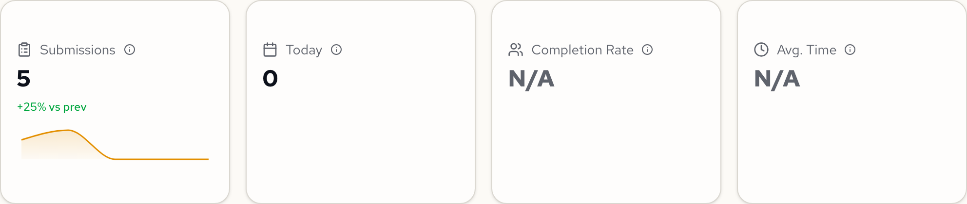
| Card | What it shows |
|---|---|
| Submissions | Total submissions in the selected date range. Includes a sparkline and a delta badge comparing against the previous equivalent period. |
| Today | Submissions received today. Also shows a delta badge. |
| Completion Rate | Percentage of users who submitted after starting the form (submitted / started). Requires Umami integration. Shows "N/A" without it. |
| Avg. Time | Average time spent on the form page. Requires Umami integration. Shows "N/A" without it. |
Completion Funnel and Traffic Sources
Below the overview cards, the dashboard shows a completion funnel and traffic source breakdown. The completion funnel tracks three stages: Viewed (page loaded), Started (first field interaction), and Submitted (form completed).
Three additional cards show where your visitors come from.
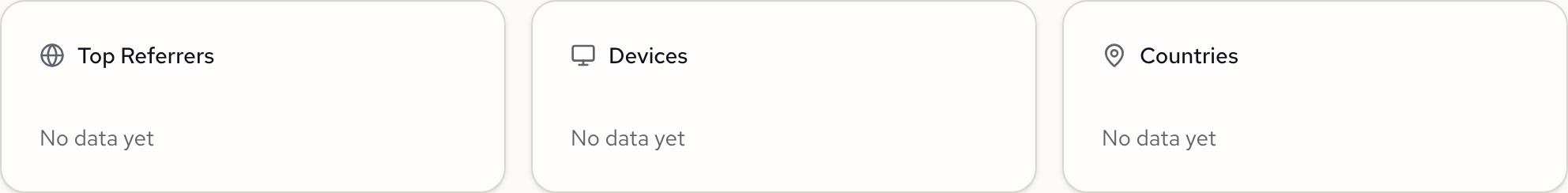
| Card | What it shows |
|---|---|
| Top Referrers | Websites that linked to your form |
| Devices | Desktop, mobile, and tablet breakdown |
| Countries | Geographic distribution of visitors |
The completion funnel and traffic source data require Umami integration. Without it, these cards display "No data yet."
Submissions Over Time
A line chart shows how submissions are distributed across the selected date range.
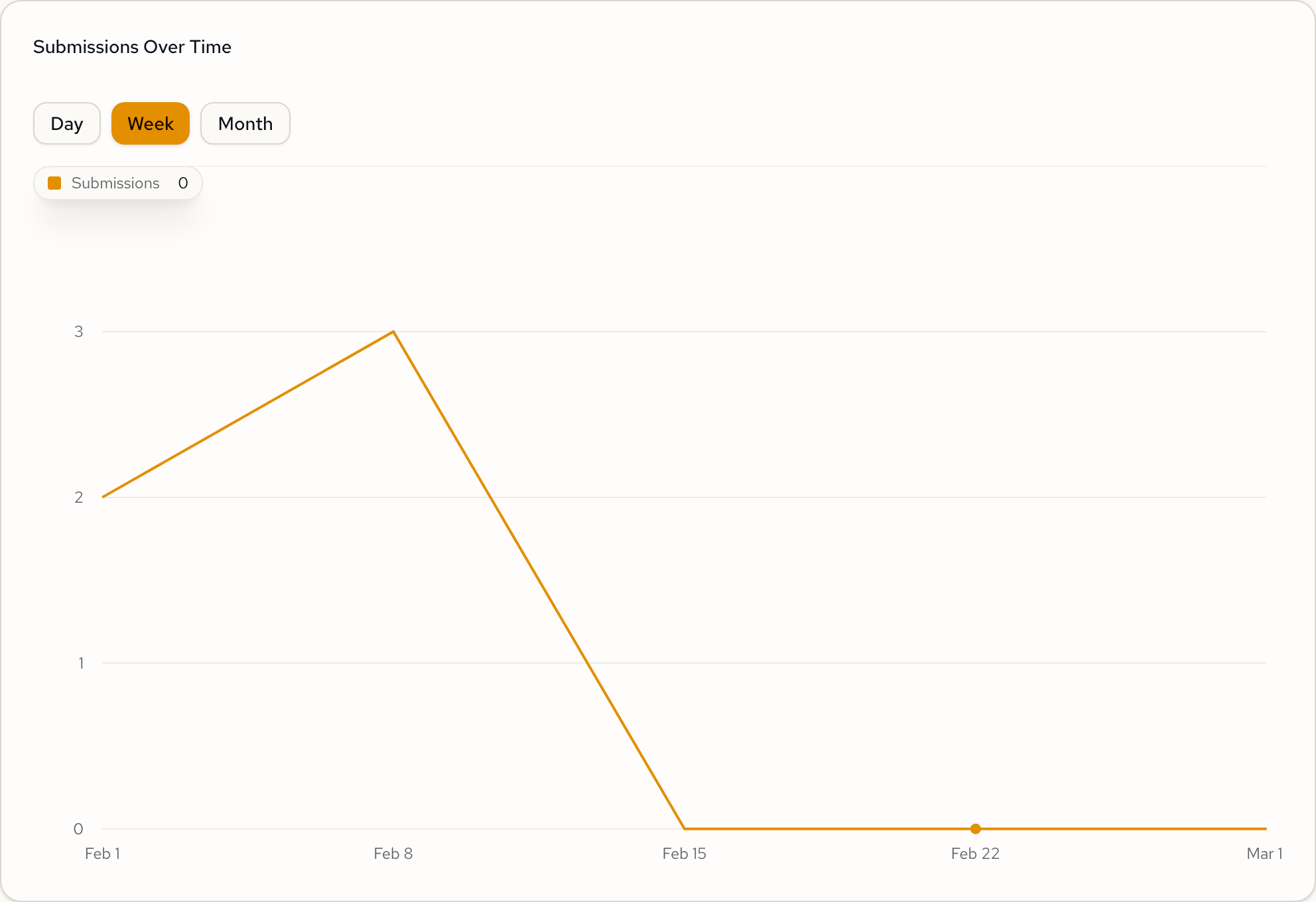
Toggle between Day, Week, and Month granularity using the buttons above the chart. The chart automatically adjusts its x-axis labels and data bucketing.
Field Breakdowns
Each field in your form gets its own card with a chart type matched to the field type.
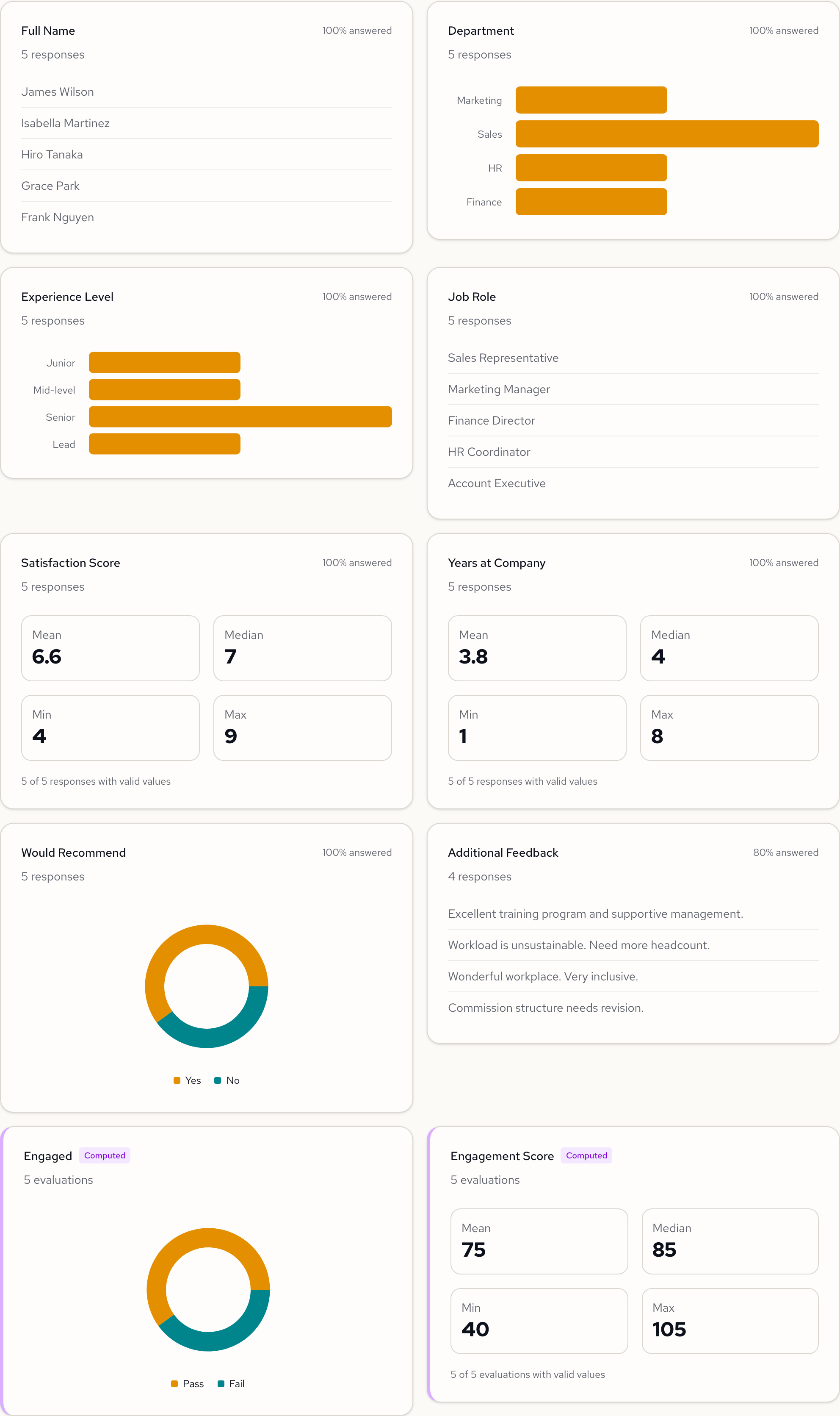
| Field type | Chart type | What it shows |
|---|---|---|
| Select | Horizontal bar chart | Distribution of selected options |
| Integer / Decimal | Numeric stats | Mean, median, min, and max values |
| Boolean | Donut chart | Yes/No split |
| Text / Textarea | Response count | Number of distinct text responses |
Each card also displays the response count and answer rate (e.g., "100% answered" or "80% answered").
Computed Outputs
If your form has computed fields, they appear at the bottom of the field grid. Computed cards are distinguished by a purple left border and a Computed badge.
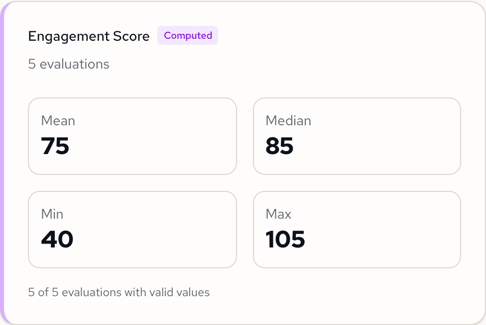
Computed outputs use the same chart type mapping as regular fields: boolean computed fields show a donut chart, and numeric computed fields show mean/median/min/max statistics.
Next Steps
- Managing Submissions: view, filter, and export individual responses.
- Publishing Forms: publish or unpublish your form, configure settings.